Showing posts with label article. Show all posts

Thursday, March 01, 2012

How To - Bookbinding - Post Bound Book


Hey look! It's my book again! Except instead of me posting about how much hard work I put into making it, I'm going to walk you through exactly how I made it. With pictures! I've started a new book, and I started photographing the whole process. I'm not going to be able to give you measurements, but you should be able to make up your own. A lot of the measurements I do give will be "an inch wider than the width of your paper." That way, you can choose your own book size. If this type of book isn't your thing, I also still have these posts with links to paperback bookbinding and hard binding books!

But, if Post Bound Japanese style books are what you want, continue on!

Materials Needed
  1. Paper for pages
    Think about what you're using the book for, and what type of paper you like using. Best part about post binding books is, you can use any type of paper, it doesn't really matter. 
  2. Paper Cutters
    I use a personal paper trimmers, an exacto knife and ruler, and scissors for different steps
  3. Book Board
    Get the good acid free stuff if you can. The thickness doesn't bother me one way or the other, so go with what you like.
  4. Sand Paper or sanding block
    It's for the book board and paper blocks
  5. Book Cloth
    You might try making your own (Google it if you don't like that process, there are 1000 more!)
  6. Decorative Paper
    For this project I used Japanese origami paper from Joanne's for the cover of the book and some handmade rice paper for the end sheets.
  7. Glue
    PVA is the best, but it has no give. It sticks. I bought something called "Professional Acid Free Glue" from Hobby Lobby and it works well for my purposes. I got it on sale. You can even try to make your own!
  8. Press
    If you have a bookbinding press (can I come live with you?) use it! If not, I use book clips, clamps, and pieces of wood. Let me tell you, if you have a book due for class the next day and you don't have access to the book press, you get /very/ creative.
  9. Screw in Posts
    These are sold at Lowe's. Unfortunately, no one who works there will have a clue what you are talking about. Look in the hardware section, in the drawers. It'll be under "Specialty fasteners"
  10. Rulers
     I have one that's clear, and one that has a metal edge for cutting. The one with the metal edge was like, 50 cents at walmart. I do have a love affair with the clear one though, it makes a lot of jobs so much easier.
  11. Cutting board
    Or a table you don't mind screwing up. It's easier to work on a nice table though. Really think about the cutting board.
  12. Time, Attention to Detail, and Anal Retentiveness
    No, I'm not joking

On with the Tutorial!


1. Step One - Cut out your paper.

I like to do this first, and then measure everything else off the paper. For this, I just cut a regular letter sized piece of paper (8.5x11") into thirds. For Japanese binding and post binding a book, a longer, thinner page works great. Here is a picture of my paper cutter. It's cheap. And it works. :)

2. Step Two - Measure out the Book Board you will need


It will need to be about half and inch wider than your paper. This will allow for a 1/4 of an inch lip around the pages of your book. I took a long piece of book board and cut the width I needed in a really long piece.

3. Step Three - Cut one inch pieces of book board out of the long piece you just cut
These are where the posts go, and the space between the one inch piece and the main piece of book board creates the hinge. More on that later.

Step 4 - Cut the large piece of book board
  
This is a bit tricky, but it usually works out. The trick is, there needs to be a 3/8ths inch space between the inch long board and the larger board, and there should be a quarter of an inch lip around each side of the paper. So that's an extra half inch. So it should be the length of the paper, plus 1/2 an inch, minus 1 3/8ths inches. I just do it by sight, lining up the boards, measuring out the spaces, and marking where I need to cut. Cut out two of them!

Step 5 - Sand the book board down
I'm sure you've noticed by now that when you use an exact knife, or a box cutter to cut the book board, it leaves you a nice, thick burr on one side of the board. The best part is, it works like a wood board. You can sand that sucker down! A sanding block works wonders, but all I can afford is some sand paper. I'd suggest doing it out side because the dust is obnoxious to all things sinus. I tried to get a picture of the burr, but I think it just looks like a shadow.

If the boards are just a bit off, sanding them down would be easier than cutting them as well.

Step 6 - Book Cloth Time!
Get out your book cloth and measure out what you will need. You can use book cloth in four ways.  

The four different ways to bind a book are, using book cloth for the whole book. There will be no decorative paper on a book done this way. Another way to do it is book cloth each side, leaving a space to put paper. (Remember, the paper needs to over lap the cloth to keep it from unraveling, don't give yourself too large a space if you only have a certain sized paper!) You can also use book cloth on the hinge edge and just the corners. Or, you can just choose to use the book cloth for only the hinge. 

You need to use book cloth at least for the hinge side (the inch piece and part of the larger main piece) because when you open and close the book it will wear away at that point. Paper is not as strong as book cloth, and will break down much faster. When you are spending this much time on a book, believe me, you want it to last for a very long time! As you can see, I went with cloth on both sides. This is called the half cloth method. I think it looks nice. I decided to make both sides equal, but I'm kind of regretting it now. You have to really think about balance and design, and one side is going to have hinges, breaking up the balance I was going for. 

Here is the back of the book cloth with everything measured out. You need a half an inch around the edge, and 3/8ths of an inch space between the two. I like to pencil everything in so I know where to put the board once I have glue all over it. It really does help. I don't have the other end piece of book cloth, it just has the half inch edges marked out. Remember! if your book board is four inches wide, you need five inches of book cloth. it's half an inch on /each/ side. 

Step 7 - Let's Glue

Here is a picture of the glue I use! I usually brush it on. I keep water and a rag near by as well, since it dries that quickly.

Step 8 - Clamping and Pressing
I've been using two pieces of masonite and book clamps to hold things flat while they are drying. This step is important, because without it, things will dry with lumps and divits and waves. Here I show how I am lining up the two pieces of book board with a strait edge, and how afterward I'm clamping everything down.

After the main part dries, put glue in the corners and fold, and then put glue on the sides and fold over again. I press it after I glue that as well, but it dries pretty quickly.

Step 9 - Decorative Paper
Here is the two pieces of book board with the book cloth glued on well, and there is also the paper I chose for this project. Now, the size of this paper should be an inch larger than the width of the book board (1/2 inch for each side) and enough to overlap the book cloth by about an 1/8 or 1/4 of an inch. Since I will be embellishing this with another paper, I made it almost the exact length of the opening.

After you cut it out, glue and press.

Step 10 - Embellishments
I cut out gold strips of paper to glue on, and took a photo of the back of the board. You can see how everything is folded over, and how you can see the hinge. Next comes the end sheets!

Step 11 - End Sheets
As end sheets are supposed to be decorative, you want to choose something different than the paper you are binding together. I chose this really nice handmade rice paper with all sorts of little speckles in it. you want to cut it out to be the same size of the paper you're binding.

To glue it in, I glue the board, and the brush glue around the edge. This makes it much easier on me. You may find gluing the whole paper is easier for you. 

My paper was very thin, and needed a lot of clamping.

Step 12 - Putting it all together

This part angers me, and I have no trick for it. I am very anal retentive and it has to be perfect. I can spend a whole bloody hour trying to stack the paper and book boards together. I'm still working on this right now.

Step 13 - Drilling the holes


I am using a regular drill, but a drill press is where it's at. The bit I'm using looks to be about 3/16ths of an inch. That way those posts can fit through the hole. The first time I drilled, the first hole worked out okay, and the second hole became wonky. To try and counteract that, I'm drilling a pilot hole first. I just picked out a thin drill bit to run through my marks first. This drilling is a pain in the butt, because until you figure out exactly what works for you, all your hard work can go up in a whirl of torn paper and tears with the push of a button. :'(

Step 14 - Screwing the posts in (hehehe)

If you get holes drilled, this is pretty easy. It takes smaller posts than you might think. I always keep an assortment on hand.

Step 15 - DONE


This is the part where you take your book to another person and go, "Look! I made it!" Or blog about it. Or start journaling. Or looking at it and wondering if you could ever use such an awesome book. Or you can start on your next one. Or, you might be having to take it into class where the teacher will break apart everything you did into bite size chunks of guilt and shame as he points out every drop of glue, every pencil mark, every bent page, and ever wrinkle.

That might have just been me though @_@

I hope you enjoyed my tutorial! If you have any questions let me know and I'll be happy to answer them. I know I didn't cover everything (like the difference between paper corners and fabric corners and how bookboard thickness affects the process) but if you run into problems, drop me a line and I'll do my best to help!

Happy bookbinding! (Believe me, you'll need the reminder)

Monday, January 30, 2012

Article - Business Plan Q1

TARDIS
Cookie Jar
Think Geek

No, I don't know why there is a photograph of a TARDIS cookie jar on this blog post. I think it's mostly because I wrote my business plan for the quarter on the first piece of paper I had handy: one with a TARDIS print out on it. I think it inspired me. How could it not? All I know is that I was watching Doctor Who and thinking about New Years resolutions, which I haven't made in some time because I never follow through, or it's something I should be doing anyway and I'm trying from last year to get better at something. So while doing a painting I was curious as to how much I was actually making, and how much I should make, and where I should focus my time. It suddenly hit me that I should write up a business plan and follow it to see if I could get more control over my art business. Seemed better than a resolution because it was more active, but it was still in the spirit of the New Year promises we all intend to keep. It just seemed like something I could actually keep, and find useful.

So here is going to be my blog post on writing a business plan. Or, more correctly, how I wrote out my business plan and how I'm using it. I hope the way I view things will help you. I know I can't do anything exactly like business majors do it as I don't know how business majors do it. Maybe I'll go back for a degree in business and do it correctly next time. But for now, here is my process.

Step One: Gather Materials


Since most of my sales are online, this was fairly easy. I just pulled up the sites with my sales and other information. You also need your marketing money and supply money and how much you spend on everything in your life. Having them in one place makes all the rest of the steps easier, but I pretty much just looked everything up while I was working on the plan.

Step Two: List Where You Sell and Your Sales


Across the top of my paper, I wrote out every place I sell work. Under that, I wrote out my sales numbers so far, and broke it down to how much I made the last month. I was also kind of anal and wrote out exactly how much growth or loss I was experiencing through the months since I had started selling on those sites.

Step Three: List Your Current Marketing Strategies for Each Venue


Here is where I put where I was marketing each of my sites, and where I was getting the most traffic. If I wasn't doing any marketing, I put that, but for the most part I at least tweet or put on facebook so I could put that if nothing else. A lot of people do ads, so this is where you'd put your ads and how much you are paying, and see exactly how much traffic and sales you are getting from those marketing strategies. For me, this is a very simple part of my page, but for someone who does a lot of marketing, this could be a whole section of a business plan.

Step Four: I figured out how much I want to be making at each venue by the end of April

This was pretty easy. I looked at my sales and looked at how much money I wanted to be bringing in at the end of April. Just a simple number. Some gigs I wanted to expand, some I wanted to remain at the current level.

Step Five: I looked at what I wanted to sell to make that money

I have several gigs that are very inexpensive, and popular, but require more work from me. I have several that are more expensive and I prefer to make money off them. I know which are more popular and I have to balance getting money to live on time, and getting good money for my work. This is where I see where I want to focus my marketing and my time.

Step Six: Reorganize Business


I have to fix where everything links to, whether I'm charging the right amount of money to get the funds I need and make sure I'm not doing too much work for too little payoff. This part is a bit intuitive for me, though I am using my info from the plan to organize things as well.

Step Seven: Work out Marketing


Decide where you want to put your money. Social media works great and is fairly inexpensive most of the time. Plus, there are ads you can do and ways to promote your craft and art. I am going to be hosting a give away to get more traffic for my social sites, which I hope goes well. It will be closer to the end of the quarter, so watch out for this!

Step Eight: Allow for Unexpected Events


Figuring out what works and what doesn't is sometimes a crap shoot, and sometimes it blows up in your face.  Just this month I didn't put any effort in promoting one of my gigs, yet it some how ended up being promoted directly from the site. This plus the marketing I was putting in at another site practically doubled my orders everywhere. This would be good were I just into this for the money. Unfortunately this ate up /all/ of my time (Notice the lack of blog posts?) and I was worried about getting everything done on time. Plus these were for projects that don't net me a lot of money. I had to reorganize my business plan to reflect this, and see how I needed to restructure my time to focus more energy on more lucrative parts of my business.

And... that's it!

So far, anyway. I am doing my best and seeing how this business plan thing is working. I am taking things I read on google and in books, and figuring out exactly what works for me. If I have any insights, of course I'll post them here! And if you have any business advice, let's here it! :)

Wednesday, October 05, 2011

Process: Step by Step

(Edited, because I should apparently not type when I have a raging headache!)

After my friend asked me about my painting process when it comes to drawing from life, I thought it would be best if I show as much of the process as I could. I do try and show myself painting on video fairly often, but a lot of times I'm painting at night and it's a pain to get my camera set up so it can see anything I am doing. I decided that step by step pictures would be a bit more helpful. 

Also, most of my process is fairly left brained. I follow a formula for a good chunk of my set up. But there comes a point of complete right brained-ness where a "how to" or a "step by step" doesn't really work. That's why there is such a jump in the last couple of pictures. But I will do my best to explain my thought process and choices. 

Step One: Choose a Subject


This is fairly simple. I raid the kitchen fruit bowl and my stash of handmade pottery a lot of times. Some people trick  ask friends to pose for them. Other people beg their dog or pet of choice to stay still. Others pay people to sit still for long hours. Clothing optional. And some people go outside and sit. That last one has a fairly different starting point for me. But I'll talk about plein air painting later. Right now, we're just drawing with people or objects in front of us. 

If you can use north light, which is a wonderful cool, diffused, stable, natural light, then YAY! I'd use that. But if I'm painting at night I find it much easier to just turn on a light and have it illuminating my fruit. During the day I use north light though. I'll write a post about why that's the painter's light of choice soon. 

So after you have your fruit arranged and the lights on, what's next?


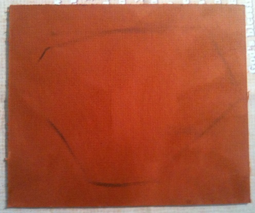
Step 2: Place the large shape on a toned ground


This is the large shape of your objects. There are several ways to do this, depending on what you are drawing. You can see that here, I just put down the large shape all the fruit kind of made. Because I'm working small, I like doing it this way.

If I were working larger, I would first give myself a margin all the way around the painting. Then I would put down a gesture, before putting down this large shape. I wouldn't have the gesture forming the outside contours of the objects, but focus more on their center placement. More like a constellation than anything.

And the toned ground. Normally I tone with raw sienna, but right now I've been using a lot of shellacked illustration and mat board. The shellac I use is amber colored, and the mat board I use is all sorts of colors. This gives me a fairly wide range from a nice pale amber to /really, really, really/ almost black dark. This was amber on top of a dark orange, so it's darker than even I'm used to. But it was next in the pile.

After this comes

Step 3: Psudo Giacometti and Contour


As you can see I'm obviously not drawing with vertical and horizontal lines as I would were I doing the Giacometti Technique in its purest form. You can however, see where I was using it to figure out where to place the bottoms of the aanar and the top of the lemon. It's very useful that way. I should also probably mention at this point that the photograph I took of the fruit was done fairly low to the table. I was sitting up a good one or two feet above that, hence you can see the top of the aanar in the painting. Remember, I'm painting this from life, and not from any photograph. 

Always be exact in your drawing. If you make a mistake, don't be afraid to correct it! There are several times I redrew parts of the fruit. If you pay attention during this step, the following steps will definitely be easier, but you should always be looking and asking, "Is this right?" and then LOOKING for the answer. Painting is like taking an open book test. The answers are always right in front of you!

Then we come to,

Step 4: Valueshapes


Here is where I start to place dark values down. Most of the time I use burnt sienna for my first shadows, but because the board I used was incredibly darker than I'm used to, I used burnt umber as well.

Here I'm drawing the shapes of the shadows, trying to make sure my line drawings are right. I'm also picking out the dark areas, and asking myself, what is darker? Squinting helps a lot here. It filters out color and hue and leaves you with swatches of dark. I then paint those shapes. I use the unpainted canvas as my lights until


Step 5: Add some lights


For awhile now I've been painting fruit just sitting on a simple white table. So right about now I fill that in so I have paint around all my objects to paint into, and pull to into their form when I need to redraw some things. You can see I've kind of worked it into the lemon here.


Step 6: Relative Color


This is the first step that I'll add color. I won't be really picky about the color, as long as the value is correct. I'll try to use warmer variations of the color in the light, and cooler in the shadows. Here you can see I used cad red light for the side of the aanar in the light, and alizarin crimson for the cool side. The side of the lemon in the light gets cad yellow light, while its shadowy area is more of a raw umber with cool yellow, or green. I think I also warmed that shadow a bit with burnt sienna in some areas too. Because my light is so warm my shadows will be cooler, with cool north light the opposite would be true. But I still like to really warm up my darks. 

Anyway, after that, I do

Step 7: Right Brained Magic Time


The next thing I do is pretty much playing with color and value. "Is this the right value? If I squint does it look right? Is the color intense enough? if it's intense enough, is it the right value? Did I mess up that shape??" 

As you can see I've only really started on the left aanar. I'm trying to build up values, and add more paint to the lights here. And that's pretty much what I did with the other fruit. Add more paint to the lights. I'm afraid I didn't take a picture before I added the highlights...

Finally at the very end:

Step 8: The darkest darks, The lightest lights


Here is where I add the final things: The darkest bits of the painting and the high lights. I really think the highlights make or break a painting. You can get away with a lot with a lot of paint and some well placed highlights!

And then after that... well, I usually wait until the next morning to get a good photograph of it in natural light. And fix anything that's still bugging me the next day. I always need that extra time to really go back and look with fresh eyes.

I can already see the shape of that lemon and that right aanar can use more of that light pink color, though it is darker than the other one. I'll see if there is something I can do to it. 

Tomorrow!

I hope my little step by step process helps, at least for the beginning stages. I know I didn't talk about color mixing or details or anything important! But I hope this allows you to tackle some blank canvas of your own!

Museums: I suppose I've been doing it wrong then!

I suppose if looking at the art in museums gets security all over you, I should be doing this:

http://journal.neilgaiman.com/2011/10/warning-not-safe-for-work-unless-you.html

In case you're wondering about it being safe for work or not, there is one picture of his wife naked from the back, fairly small, all the way down at the bottom of the blog post.

I've been using museums incorrectly my whole life!


(This blog post is meant for humor. And because I like Neil Gaiman.)

Tuesday, September 13, 2011

Museums: Not for artists any more

I have been to museums a grand total of three times in my life. Well, let me qualify that. I've been to museums that showed more than modern or contemporary art, and focused in on art of the past three times in my life. The first time I went I was a senior in high school and I went to the Art Institute of Chicago. The second time I had just finished my art degree, I was in my first year of physics classes and I once again went to the Art Institute of Chicago. The third time happened just the other day, during the first year of my art career, at the Brooks Museum of Art in Memphis.

The first time I was just about to graduate high school and I had taken a few art classes. As many as they'd let me take. Suffice it to say I was not very knowledgeable about the process of painting or drawing but I could get a likeness and given enough time I could make a pretty decent painting, mostly by trial and error. This was my most pleasant trip to a museum. Let me qualify again: this was the one trip I didn't almost get thrown out of a museum. I did lose my group and end up staying there for over six hours, but I see this as a huge plus! We did the tour, they asked questions, I answered as we dissected the meaning of some more modern pieces. And then they let us go. Oh, My, God! Of course the first thing we did is get let out right next to the impressionists and post impressionists. It was the first time I had ever seen a piece of art I had liked from a text book in person. A little dancer done in chalk by Degas. It was so small, so intimate, I could see the way the chalk lay on top of the paper. I started bawling right then, just standing in front of art for the first time in my life. The next was a painting of Renoir, something I had done a master copy of from a book. I started crying again. When asked what was wrong, all I could say was, "Look at it! Just, look at it!" And finally I pulled myself together and went to just look at art for the next six hours, sans any more complete emotional break downs.

And then I returned home, got an art degree, and came back once again. Totally different experience. I know I was looking forward to seeing one painting I had loved as a senior. Now I can't even remember the name or the title, or anything about it, really. I looked at it, and was so confused. Had I really liked this before? Where were the colors I remembered? It was drawn well, but where was the part of it that moved me? It was just so flat and dead from what I remembered before. I shrugged and started walking around to view the art. This is where the problems started. I noticed most people progressing in a fairly linear fashion through the rooms, standing in front of some pieces, skipping others, but still, in a pretty orderly fashion. I, however, well.... Out of the corner of my eye I'd see a piece that would draw me in, I'd stare from across the room, the walk in, get as close as I could and try to figure out how it was painted. Then I'd back up, usually into someone, and then go forward to study it again, and then I would see another painting, and I'd practically have to run to it. I'd go from one room to another and back, without any sort of plan other than "Oh my god, I can't believe I'll get to see it in person!" once a piece caught my attention. Once a crowed had gathered around a fairly large work, and right beside it was a small self-portrait by Chardin. Immediately the portrait drew me in, almost made me cry again, seeing the color and the brushstrokes. I am pretty sure I began talking to myself about how much more amazing it was in person and just gushing over it. Honestly, from reproductions I had not cared much for it, but seriously, in person? Amazing! And then I noticed the crowed around the large painting, some staring curiously at my reaction, and I looked at the other work politely, shrugged a bit, and then noticed another portrait two rooms away and I was gone. At this point I had been asked to slow down numerous times, and one friend I was with had gotten in trouble for using a cell phone in a special exhibit, so at this point she wasn't with me. And then there were the Caravaggio's.

This is where I almost get thrown out. Apparently getting really close to see how someone paints something in a special exhibit is just as bad as using a cell phone. I am having a rapturous experience, and under normal circumstances I'm usually focused intently on one thing, at this point I'm pretty sure I've blocked everything else out. Someone's talking to me and I just start babbling all I know about Caravaggio, which at the time was a God awful amount to know because I had done several papers on him and it was all fresh in my mind, plus I was babbling about /how/ he was painting. And it turns out I'm gushing about the paintings to a security guard who just wants me to step back while I'm gesturing wildly trying to make him understand exactly how the light is layered and "oh my god, look at the glazing!"

Yeah. I think he was happy when I moved to another painting to compare. (It took me awhile to realize it was a security guard).

The same thing pretty much happened in the room with all the Corot's as well. And the Van Gogh's.And let's just say I'm pretty sure all the security guards at this point are well aware that I'm probably slightly insane and they should watch me. Because they do. And they ask me to step back a lot. Which usually just started me talking about how they painted something I was looking at and did nothing for my moving away from the paintings. I was so focused on the art they might have asked me to leave and I might have answered, "Just let me see how he mixed this color" or "do you see how he worked into this glaze" instead of leaving. I was so focused on art everything else was autopilot.

I think they were all happy when I moved on to the gift shop.

And then there was the Brooks Museum. My cousin and her husband and I went the other day. Yeah. First off, bad floor plan. The first thing I notice is a painting of a lobster that I really want to see. So I go see it. Unfortunately I step through some columns that I didn't even notice. Unfortunately this makes a security guard mad. And of course I'm just like, "Really? The space is so huge..." I mean, seriously, a five hundred pound person can fit through so easily, how was I supposed to know I shouldn't walk that way? There was no sign... But whatever. Their bad museum design, not mine, though I was kinda wary about where I could go after that. How was I supposed to know what was right?

And then came the part where we were almost thrown out. I do not have to have people around me to talk about art. So when I have captives with me, aka my cousin and her husband, I can talk a lot. And I gesture a lot, and I point out things a lot. So a security guard comes up to us and says something about it looks like we're touching the art on camera. I turn to face her and give a kind of dismissive smile and say, "Well, we aren't touching the art, thank you though" And then turn around to completely ignore her, even though she follows us throughout the whole exhibit.

I guess it wouldn't have been so bad there except with the way the lights were set up I couldn't be comfortable looking at details from one to two feet away. The light glared so I had to get right up on it to see what I was interested in: how the paint was applied on the canvas.

I suppose once I get used to going to museums like a civilized person I'll get better at this. But really! I got there not to look at art, you can do that online or from any art book, but to study and learn how it was done from the great masters themselves! Good artists not only do a magic trick in front of you, but literally show you how it's done. It's like they are painting right in front of you if you know how to look, and to me that's better than chocolate.

When a writer reads like a writer, they aren't reading a book like most people. They certainly can read a book like most people, but to read like a writer you read in an entirely different way, asking why a writer is saying something, using a certain figure of speech, and writing in a certain idiom. For a carpenter to look at a chair like a carpenter, he's looking at it, taking it apart in his mind, putting it together, wondering about the function of different pieces. That doesn't mean he can't sit in it. As an artist, I can look at art and just see it for the image it is. But I also can look at each brushstroke, each glazed color, see the materials, see how colors stack together, wonder at the use of value and elements of art and composition. And the best way to do that is look at the actual work, because you can't get that in a reproduction, no matter how high definition the camera goes, no matter the light used to photograph it. It's certainly good to look at art no matter how you can. But it's best in person.

As long as you don't get thrown out of the museum.

Tuesday, July 15, 2008

Article: Giacometti Drawing Technique

Alberto Giacometti.

One of my transplant professors once remarked that he thought that the art department should build an alter to Giacometti for us to bow down to every morning. I guess he had a point, as every teacher who had been there taught the Giacometti method (Usually just referred to as Giacometti) as if it were some form of scripture. My favorite teacher, at the beginning of every semester, would hand out the Giacometti Waiver to all of his students which suggested if they didn't use the method it was their own decision and if their artwork didn't turn out as planned, well, too bad. It was a technique that undoubtedly worked, but was such a pain in the butt to learn.

Albert Giacometti seemed to me an odd choice. The method didn't typically render anything remotely in his style (from what I could see) and I really had no idea what he had to do with the whole thing. The story I heard (but could never really verify) stated he was hit by a taxi and became obsessed with where things appeared in space. The searching lines so obvious in his work are the only things that connect the man and the method. At least for me. If you can clear this up, please leave a comment.

I'm moving on to the technique.

When an artist looks it does not matter what is being looked at. A still life, a landscape, a person, anything, the object doesn't matter. The only thing that matters for a perfect rendering is where everything is. As my teacher puts it, "The most important thing in drawing is the most important thing in real estate: Location, Location, Location!" A shape isn't important. Do not try to reproduce a shape, but the location of the shape. Do not ask "What shape is that?" but ask "Where?" Where exactly it seems to fade, or become darker, or something else entirely? This may seem overwhelming at first, where exactly do we start on a blank sheet of paper? How do we measure?

The Grid

The grid is not a new concept for artists. Durer has an infamous set up that comes readily to mind. I am sure everyone finds the concept familiar: Evenly spaced vertical and horizontal lines are placed on the drawing and painting surface, scaled down and put on the image that is being reproduced, and the relationship between the objects and the lines is dutifully reproduced in a scantron like way. Yay.

What is wrong with this? A few things come to mind. The first problem is without a complicated 3D grid set up in front of a model, you are stuck reproducing flat, already drawn images, or photographs. Which I think is pretty good for practice, but doesn't work so well if you want to draw from life, do plein air landscapes, or work from a master copy you cannot grid off (without getting kicked out of the museums at any rate).

It is also arbitrary. We can choose one inch grids, two inch, five centimeters, whatever, and the only thing that really matters is the proportion of the two grids. There is no real relation between the grid and the objects being created. The grid certainly makes the process easier, and it does have its place in learning, but it's good to know the limitations of tools.

And with this type of grid, an artist will more than likely put down a contour line and rarely move it. The searching lines that put an object in space are lost.

The Giacometti Grid

The defining characteristic of the Giacometti grid is that the vertical and horizontal lines used are a response to the objects themselves. The lines are not some arbitrary tool, but an integral part of the drawing process that allows the artist to really engage in a conversation with what is seen.

A lot of artists, while drawing, will use a vertical line to see where a shoulder lines up with the foot of a figure, or how high an apple is compared to the honey jar in a still life. It's a pretty common practice to use a plumb line (or a paintbrush as one). And the Giacometti grid is no different, except in application. In a pure Giacometti drawing, no diagonals or contour lines are expressed. Just the searching, vertical and horizontal lines of relationships between points.


Giacometti Figures in a Room
18 x 24
Graphite on Newsprint

This is one of my first (fairly) good Giacometti drawings I did almost four years ago. I was still relying too much on contour, but I am getting the searching line down.

Their are two ways to use this method, the first you can decide to do a gesture to get things in kind of the right position, and then begin moving things to the exact location. For that image I did not start with a quick gesture (do not read as outline, I'll do another article on gesture drawing soon).

Let's say we are drawing a still life with bottles and apples.

To start, you pick a place to put a vertical line, such as the edge of a bottle, or the center, and make sure you lightly add this line all the way from the top to the bottom of the paper, not just where you think the object should begin and end. If you want to, mark the points where you think this will be the case. Then move on to another vertical, where the space between the two lines will be the space between two objects. The key to this step is working very lightly. These lines are not etched in stone and will have to be moved.

I usually do a few vertical, and move on to horizontal lines, eye level or the horizon is a good horizontal to start with. Then I work with the heights of the objects, and seeing where those grid lines intersect with the other objects.

After that work back and forth. The relationship between all the lines is what is important, so measure distances, and see exactly where all the lines cross, meet. Do not feel you have to stay with a line, if a line you've already done seems to be in the wrong place. Remember, place is the most important! Just make a darker, more correct line. Through the course of the drawing, you'll get darker and darker, and everything should be more and more correct.

Proportions are easy to measure, and if you get something wrong, you don't have to erase, just a new line, a new point, and on to correct everything else.

I like to keep little notes, small dots that suggest the nature of what they represent. A dark smudge for a shadow, longer dot for a line, small bent line for a corner. These are not outlines, but small notes that are easy to move around. That way we are not married to our outlines. Because there are none!

While the obvious drawback is this technique in its pure form will not result in a finished piece, using this form for practice will help anyone see location so they can become a better draftsman. The other drawback is that this technique is hard to learn. I have seen some of the best artists just reduced to tears while learning this. (And blind contour drawing as well, but more people seem familiar with this.) But it is invaluable if you ever do learn this. Everyone can use it in the composition stages of their work, and everyone who learns and masters this technique is always a better artist than when they started.

Tune is next time when I explain this with how to pictures.
I've just been informed artists are visual learners and I'm an anomaly. Fun.

Ja!

Wednesday, July 18, 2007

Article: Zorn Palette

Self Portrait in Red Coat
Anders Zorn


For about three months now, I have been working with a limited palette my painting teacher refers to as the Zorn Palette. For about as long, the only thing I knew about Zorn or the Palette were the colors that were used: White, Ivory black, Yellow Ocher, and either Vermilion or Cadmium Red Light or Med. I had never even seen a painting by Zorn, or if I had, I had not recognized it for what it was.

Anders Zorn was a Swedish painter, famous for his portraits of people of Delarna, Sweden and his nude figures in nature. Though what I am using is referred to as the Zorn Palette, his work is not limited to just those four colors though you can see how the palette gets its name. The high chroma reds and the low chroma blue grays all cooled by yellow and white show a mastery that most artists cannot get even with tubes of forty modern colors at their disposal. To see more of his work, I'd suggest here and here. And, as I knew next to nothing about him or his personal life until about a week ago, I'm not going to try and do his history justice. I'm just going to tell you to do some reading. It's quite interesting.

Now, using this palette is what I do. It may seem at first that yellow, red, black and white can't get you a wide range of colors, but it can. The Palette, as I have said, consists of just four colors and is based on a Red, Yellow and Blue scheme. The red is bright, warm Vermilion or Cad Red Lt. It can be cooled with white or tempered with black down to a wooden brown. The yellow is yellow ocher and this cool, muted yellow is perhaps the most important color for portrait painting I can think of. It can be enlivened by white, and turned into a green by black. Yellow ocher and the Cad Red Lt. can make oranges that can be turned into beautiful skin tones in light with white. Ivory black and white create the softest low chroma blue tones that are absolutely beautiful. Add a bit of vermilion to the mixture for a smoky purple, or yellow for an even lighter, cooler green. There you have it, a range of color from warm red to cool purple and a range of value from white to black.

But that isn't really what makes this palette special. You have to know about color theory to mix the colors that you need, but you also need to know enough color theory to know what colors to put next to each other. Simultaneous contrast is an effect that results in the complementary of a color being generated spontaneously. What this means is, if you take a gray square and place it in a yellow field, the gray square will take on a purple cast. If it's in an orange field, it will look blue, and in red, it will look green. And vice a versa for all of these. If you mix a bit of blue in with the gray, and then put it on an orange field, it will look a lot more blue! By contrast, adding orange to your gray will almost negate the simultaneous contrast and turn your gray lifeless and dull if put on the exact same orange field.

Knowing this is crucial if you want to use this palette. Yes, black and white does make a gray with a slightly blue cast. If you put this in a field of orange, or say, Cad Red Light, it will look even more blue, and give you even more of the color you want. If you want the smoky purple to look more purple, a field of yellow ocher will make the color purple pop!

This is also important when it comes to value. If you want to have a very white highlight, make sure the area around it is dark enough so the highlight stands out, if there is a shadowy area, keep the chroma low, and, while it's good to find darks within darks, make sure they are dark! Don't go too light! Save that for the lighted areas of your subject!

Another thing I've found is that knowing about optical blending is important. What is that you ask? Think of Seurat and Sunday Afternoon on the Island of Grande Jatte. By using dots of pure yellow and blue pigment next to each other, Seurat tricks our eye into seeing green. With small dots of red and orange, the green is muted even with these high key colors. This helps when I want a more intense green in this palette. By using dots of pure blue and yellow ocher inlaid with my yellow/black green, the green looks brighter. And, if you put that green next to cad red light... or a brown if your green is lighter... wow! It's amazing what it can look like. I did this in my Chakra Stone picture. The green moss agate is blue and yellow ocher and green, with a bit of cad red in the yellow stone right next to it. Plus it's on that yellow red card. I slightly modified the colors around each of the stones. While it looks mostly like a solid color, it is anything but!

The best thing about this palette is that it's perfect for figure work from life. I like it because I don't have to remember a bunch of reds and yellows and their properties and what happens if I mix this red with white, or this red, or this black or this color and so on. There are four tubes of paint, and it isn't an earth tone palette without a strong color. I can get amazing results and respond almost immediately to my subject. It is also easy for me to carry around. I like being able to pull out four tubes of paint, a metal can of odorless spirits and a shellacked card and painting straight from life just about anywhere. Of course I could just do everything the normal way and carry around watercolors. This palette also makes you think. Painting under the worst of circumstances is still an act of thought, but this really helps to internalize color theory and makes you stretch to solve problems.

The obvious problem is that there is no blue. It's possible to do a landscape, but it is hard with this palette. I modify this palette slightly when I have high keyed blue objects or a spring landscape in front of me. I might also switch my ocher with a more modern zinc yellow. The greens I can mix with that and black are perfect for landscape.

While the lack of certain colors can be seen as a problem, the ease with which the palette can be modified by a sensitive artist really makes up for this slight flaw. The only other flaw is that none of the colors are good for glazing. The red, yellow, and white are opaque and horrible glazing colors and black would just serve to give a Caravaggio like effect, but wouldn't be good for helping with warm/cool color modulation. I've seen people go back in with burnt sienna and glaze that way, and it really is very beautiful. I'm still working with wet into wet ideas, but I love what can be done.

If you have any questions, or would like to post a link to a piece you've done with this palette, or another similar one, please do! I've just started working with it and I'd love conversation on it, or examples of what can be done, or to see your process and answer whatever questions I can.

Also, I've been selling some of my paintings on eBay, please see which paintings I have for sale here!