(Edited, because I should apparently not type when I have a raging headache!)
After my friend asked me about my painting process when it comes to drawing from life, I thought it would be best if I show as much of the process as I could. I do try and show myself painting on video fairly often, but a lot of times I'm painting at night and it's a pain to get my camera set up so it can see anything I am doing. I decided that step by step pictures would be a bit more helpful.
Also, most of my process is fairly left brained. I follow a formula for a good chunk of my set up. But there comes a point of complete right brained-ness where a "how to" or a "step by step" doesn't really work. That's why there is such a jump in the last couple of pictures. But I will do my best to explain my thought process and choices.
Step One: Choose a Subject

This is fairly simple. I raid the kitchen fruit bowl and my stash of handmade pottery a lot of times. Some people trick ask friends to pose for them. Other people beg their dog or pet of choice to stay still. Others pay people to sit still for long hours. Clothing optional. And some people go outside and sit. That last one has a fairly different starting point for me. But I'll talk about plein air painting later. Right now, we're just drawing with people or objects in front of us.
If you can use north light, which is a wonderful cool, diffused, stable, natural light, then YAY! I'd use that. But if I'm painting at night I find it much easier to just turn on a light and have it illuminating my fruit. During the day I use north light though. I'll write a post about why that's the painter's light of choice soon.
So after you have your fruit arranged and the lights on, what's next?
Step 2: Place the large shape on a toned ground
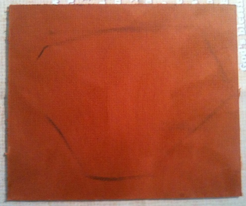
This is the large shape of your objects. There are several ways to do this, depending on what you are drawing. You can see that here, I just put down the large shape all the fruit kind of made. Because I'm working small, I like doing it this way.
If I were working larger, I would first give myself a margin all the way around the painting. Then I would put down a gesture, before putting down this large shape. I wouldn't have the gesture forming the outside contours of the objects, but focus more on their center placement. More like a constellation than anything.
And the toned ground. Normally I tone with raw sienna, but right now I've been using a lot of shellacked illustration and mat board. The shellac I use is amber colored, and the mat board I use is all sorts of colors. This gives me a fairly wide range from a nice pale amber to /really, really, really/ almost black dark. This was amber on top of a dark orange, so it's darker than even I'm used to. But it was next in the pile.
After this comes
Step 3: Psudo Giacometti and Contour

As you can see I'm obviously not drawing with vertical and horizontal lines as I would were I doing the Giacometti Technique in its purest form. You can however, see where I was using it to figure out where to place the bottoms of the aanar and the top of the lemon. It's very useful that way. I should also probably mention at this point that the photograph I took of the fruit was done fairly low to the table. I was sitting up a good one or two feet above that, hence you can see the top of the aanar in the painting. Remember, I'm painting this from life, and not from any photograph.
Always be exact in your drawing. If you make a mistake, don't be afraid to correct it! There are several times I redrew parts of the fruit. If you pay attention during this step, the following steps will definitely be easier, but you should always be looking and asking, "Is this right?" and then LOOKING for the answer. Painting is like taking an open book test. The answers are always right in front of you!
Then we come to,

Here is where I start to place dark values down. Most of the time I use burnt sienna for my first shadows, but because the board I used was incredibly darker than I'm used to, I used burnt umber as well.
Here I'm drawing the shapes of the shadows, trying to make sure my line drawings are right. I'm also picking out the dark areas, and asking myself, what is darker? Squinting helps a lot here. It filters out color and hue and leaves you with swatches of dark. I then paint those shapes. I use the unpainted canvas as my lights until
Step 5: Add some lights

For awhile now I've been painting fruit just sitting on a simple white table. So right about now I fill that in so I have paint around all my objects to paint into, and pull to into their form when I need to redraw some things. You can see I've kind of worked it into the lemon here.
Step 6: Relative Color

This is the first step that I'll add color. I won't be really picky about the color, as long as the value is correct. I'll try to use warmer variations of the color in the light, and cooler in the shadows. Here you can see I used cad red light for the side of the aanar in the light, and alizarin crimson for the cool side. The side of the lemon in the light gets cad yellow light, while its shadowy area is more of a raw umber with cool yellow, or green. I think I also warmed that shadow a bit with burnt sienna in some areas too. Because my light is so warm my shadows will be cooler, with cool north light the opposite would be true. But I still like to really warm up my darks.
Anyway, after that, I do
Step 7: Right Brained Magic Time

The next thing I do is pretty much playing with color and value. "Is this the right value? If I squint does it look right? Is the color intense enough? if it's intense enough, is it the right value? Did I mess up that shape??"
As you can see I've only really started on the left aanar. I'm trying to build up values, and add more paint to the lights here. And that's pretty much what I did with the other fruit. Add more paint to the lights. I'm afraid I didn't take a picture before I added the highlights...
Finally at the very end:
Step 8: The darkest darks, The lightest lights

Here is where I add the final things: The darkest bits of the painting and the high lights. I really think the highlights make or break a painting. You can get away with a lot with a lot of paint and some well placed highlights!
And then after that... well, I usually wait until the next morning to get a good photograph of it in natural light. And fix anything that's still bugging me the next day. I always need that extra time to really go back and look with fresh eyes.
I can already see the shape of that lemon and that right aanar can use more of that light pink color, though it is darker than the other one. I'll see if there is something I can do to it.
Tomorrow!
I hope my little step by step process helps, at least for the beginning stages. I know I didn't talk about color mixing or details or anything important! But I hope this allows you to tackle some blank canvas of your own!
2 comments:
Hi, Allison. Just following your paint steps and it's amazing what transpires between step 7 and 8 - that's where the magic kicks in. Is this a typical painting process or one that you use individually? The squinting part is interesting also. At one point when I was considering taking up painting (which I may still do) I used squinting to try to see and differentiate colors not really knowing what I was doing. Now I can see what you are talking about. Another thing that would help me is to watch an artist at work - I learn so much more by watching (i.e, Bob Ross.)
Hello there!
I'm really glad you liked my process post thingy, I just went back and edited it, and I'll probably edit it some more as I keep thinking of things to fix and add.
Let's see. I'm not sure if it's a "typical" painting process, but it is how we were taught at Tech by the best teachers, and it's a good solid way to start. No wondering where pieces of the composition are going to end up and whether or not something will fit. But that being said there are some schools that teach that the under painting should be a lot more finished and colors should be worked into and glazed on top of the black and white painting.
Even when learning this everyone kind of had their own process, even if they followed this fairly closely.
And I love watching other artists work! You learn so much about how paint works and what doesn't work and you can learn from everyone. That's what I miss about college I think: having painters around me all the time! Because there is always something new to learn.
Good artists borrow, great artists steal! And I'm not talking copy right infringement here, but artists should learn a technique and not just use it, but make it their own!
You should definitely try some painting. Well, I'm a bit biased. My mom started painting some, and I wish I was there to paint with her. Y'all should see about having painting days! Like at Landry Vineyards with the Brushes and Wine events.
Post a Comment